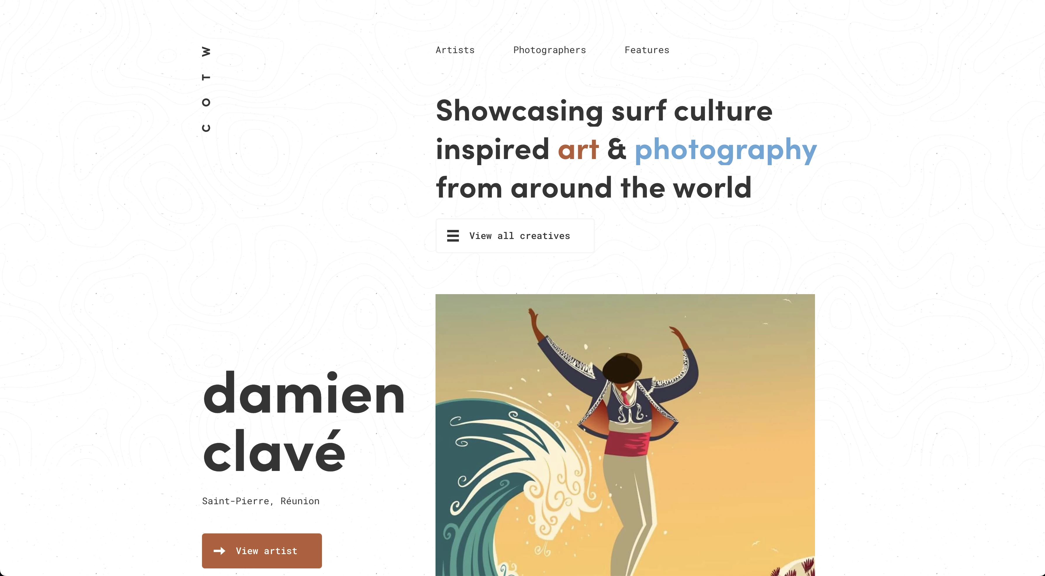
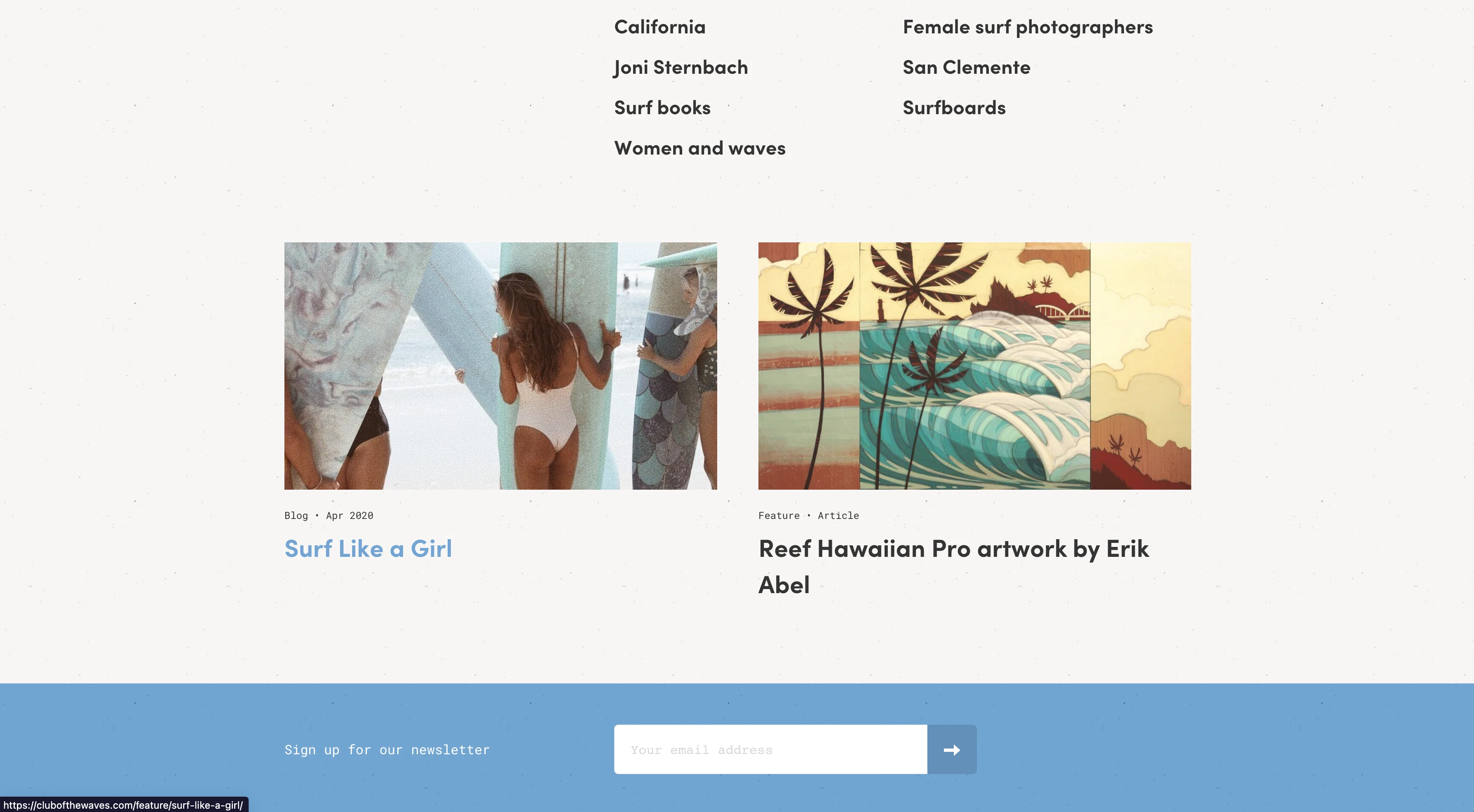
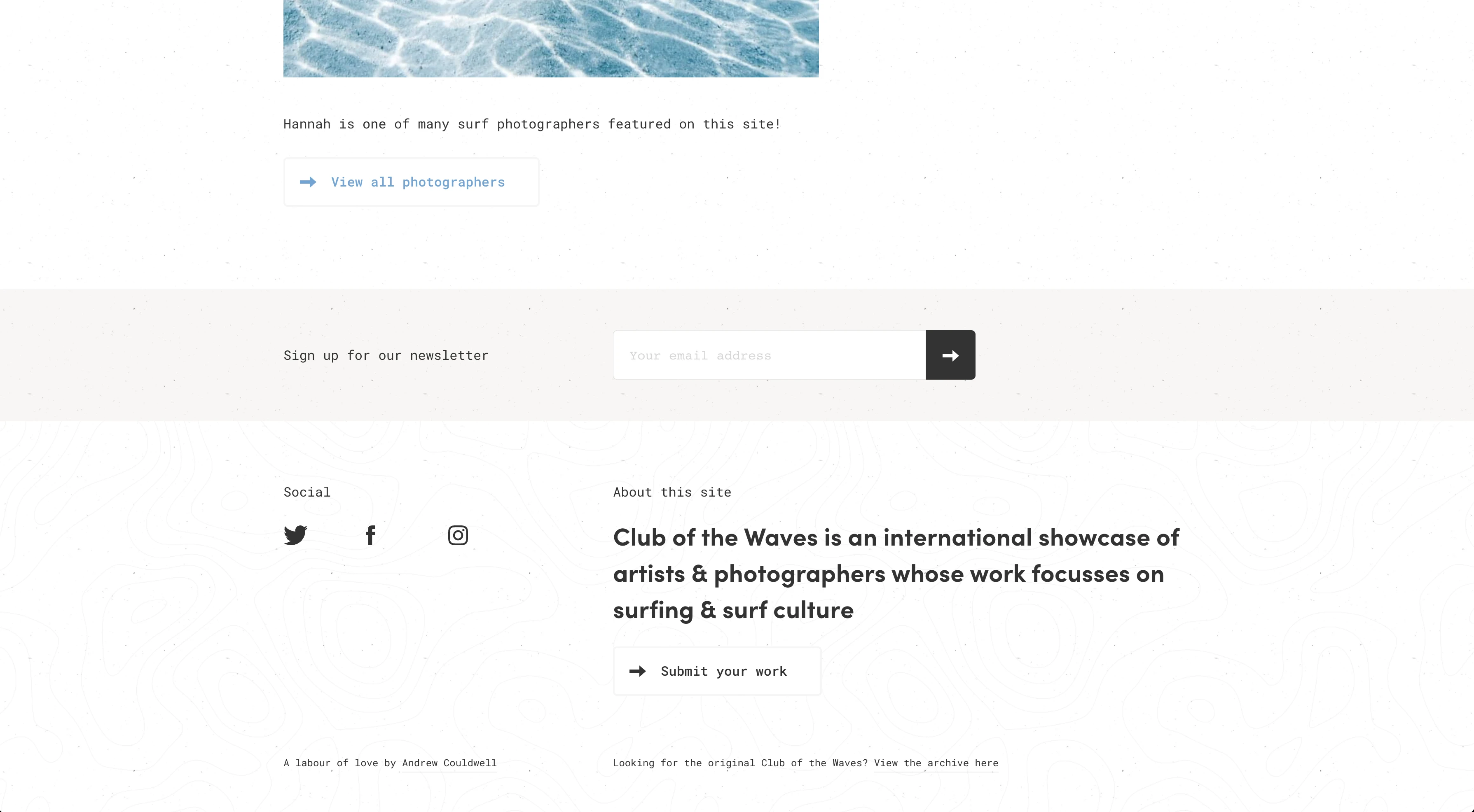
What originally intrigued you about this design? Are you still drawn to it the same way as before?
The initial thing that caught my eye was how linear the site looked despite having no lines, aside from the burger-like icon. The logo/brand being turned vertically probably helps that notion. But the alignment of the elements on the site also aid in that linear feel. The alignment on this site is very prominent and looks as though a lot of time and attention was given to it.
Everything on the site, page by page, looks extremeley tidy and neat as if every pixel was carefully placed. The minimal use of colors in the design itself lead to this very clean look.
What is the purpose of the design? How has this affected the design?
The purpose is to showcase art and photography; specifically, art and photography inspired by surf culture. The linear, grid-based layout of the site I think was created in effort to give the images (the art and photography in this case) the limelight.
I'm not a surfer or know a thing about surf culture but when I think of surf, I think California, beaches, water, sand and sunsets. I think this may have had a lot of influence on the color scheme. Blue, burnt orange and the sandy bronish background color all have connections to the aforementioned aspects of "surf."
How does this design make you feel?
The design has a very calming effect. The subtleness of the color scheme, the use of bare minimum differences in elements (colors, type sizes, typefaces, etc.), and the orderly layout with ample white space has a peaceful feel that carries over to the user.
How does the type work with the design?
Expertly... the use of the chunky Sofia font for headings draw attention without being cumbersome or loud. The body copy plays counterpart to the chunky headlines being a mono font, thin without compromising radability. Both fonts add to the feelings of calmness and tranquility. The type presents copy very well without competing with the art and photography.
The type choices and sizes help in promoting the linear and orderly look of the site. As I type this, I am reminded that it is a mono font and could also be a reason for the "linear" look of the site. This would be good to remember and/or keep as a design tip/trick: use mono font for copy if one desired effect/look is "linear" or grid-like.
What could you improve on in this design?
I have had a very difficult time thinking of what or how I could improve on this design and I can't come up with anything. I will revisit this site after a while to see if I can think of anything after some practice and more journaling.
@admin | September 21, 2022 | Club of the Waves


