What originally intrigued you about this design? Are you still drawn to it the same way as before?
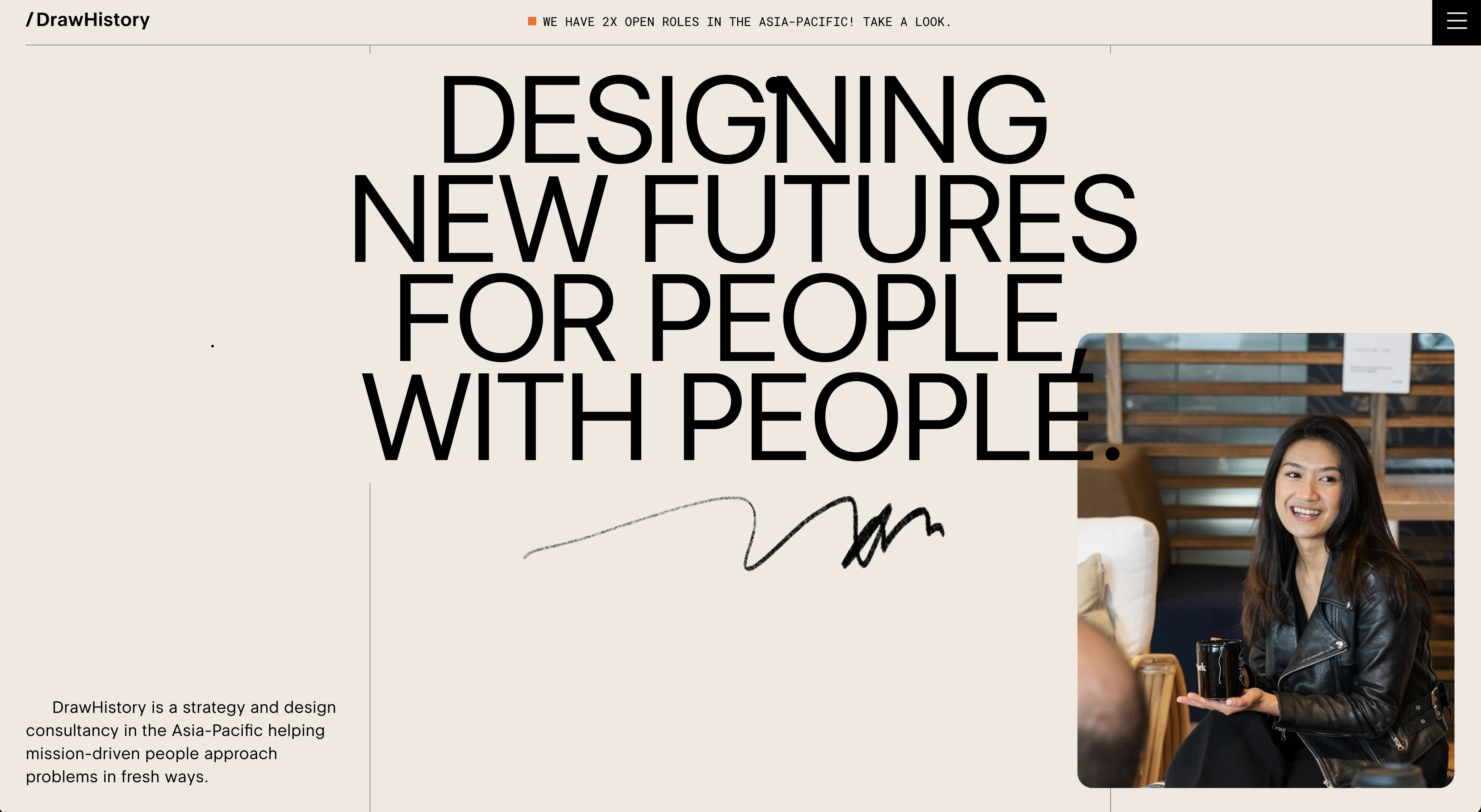
The screenshot for the homepage looked intriguing with its minimal design, large type and a bit off-balance. But it worked and it worked well. I wasn't feeling as though it was off-balance in a bad way. It actually made the design even more intriguing as to how it looks pleasant to my eye even though it is slightly off kilter. I am drawn to it even more after I've looked at it for a while as I keep trying to figure out how the designer(s) made it work so well. Minimal design is very difficult to create, in my opinion. And this design, I imagine, probably took some time in getting it to work.
What is the purpose of the design? How has this affected the design?
The purpose seems to be to inform the viewer of what exactly the design consultancy does and get across it's mission and purpose. I feel like agency sites' main purpose is to entice viewers into their deisgn porfolio, engage potential clients and utlimately convince potential clients that they should be actual clients. However, the DrawHistory site seems like it is mostly to inform the audience of what they do and why they do it. There seems to be an attempt at an emotional or ethical connection with the audience. The design, I feel, affects that puropse by providing a modern look and feel, convincing the audience that their approach to solving problems is modern and unique.
How does this design make you feel?
Honestly, it makes me feel inadequate as a designer. But in all seriousness, it creates a sense of excitement. I want to learn more about the agency and the work they do. It also makes me feel as if they are true experts in what they do and can solve problems in new and creative ways.
How does the type work with the design?
The type is definitely simple and clean which makes the design work and look and feel the same way. Simple, uncluttered, clean and modern. The large type easily helps the reader identify the sections of the page they're on but also entice the reader to actually read the headlines. I assume this is in hopes of getting the reader to engage with the article/section of the site.
What could you improve on in this design?
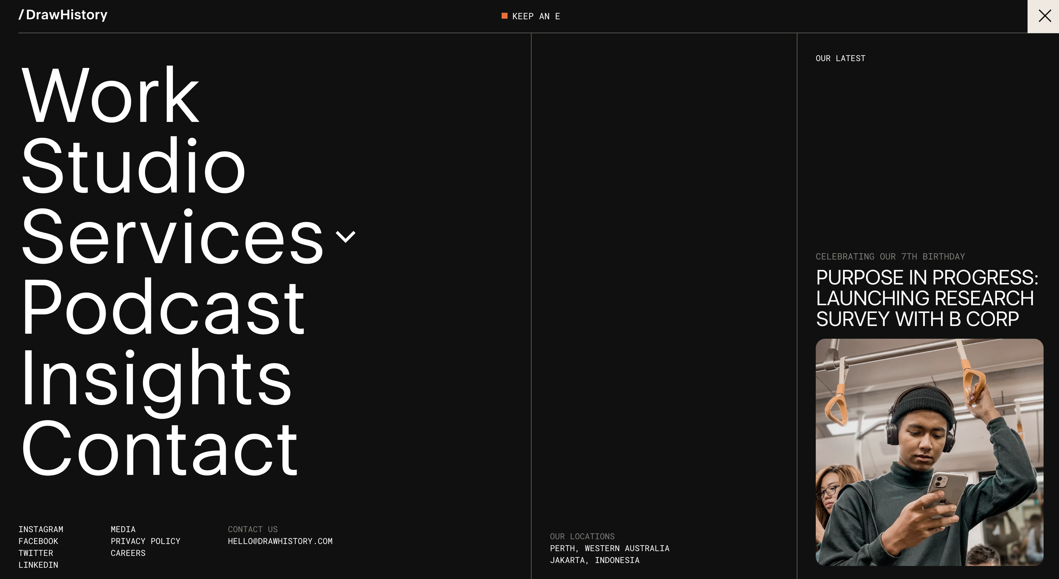
One small change I think could improve the design is the addition of small yet bold icons. I think this could help identify different sections of the site as parts of a group (think something like tags).
I'd also make the newsletter sign-up form a little more prominent, add more spacing and some pops of color.
@admin | September 19, 2022 | Draw History