What originally intrigued you about this design? Are you still drawn to it the same way as before?
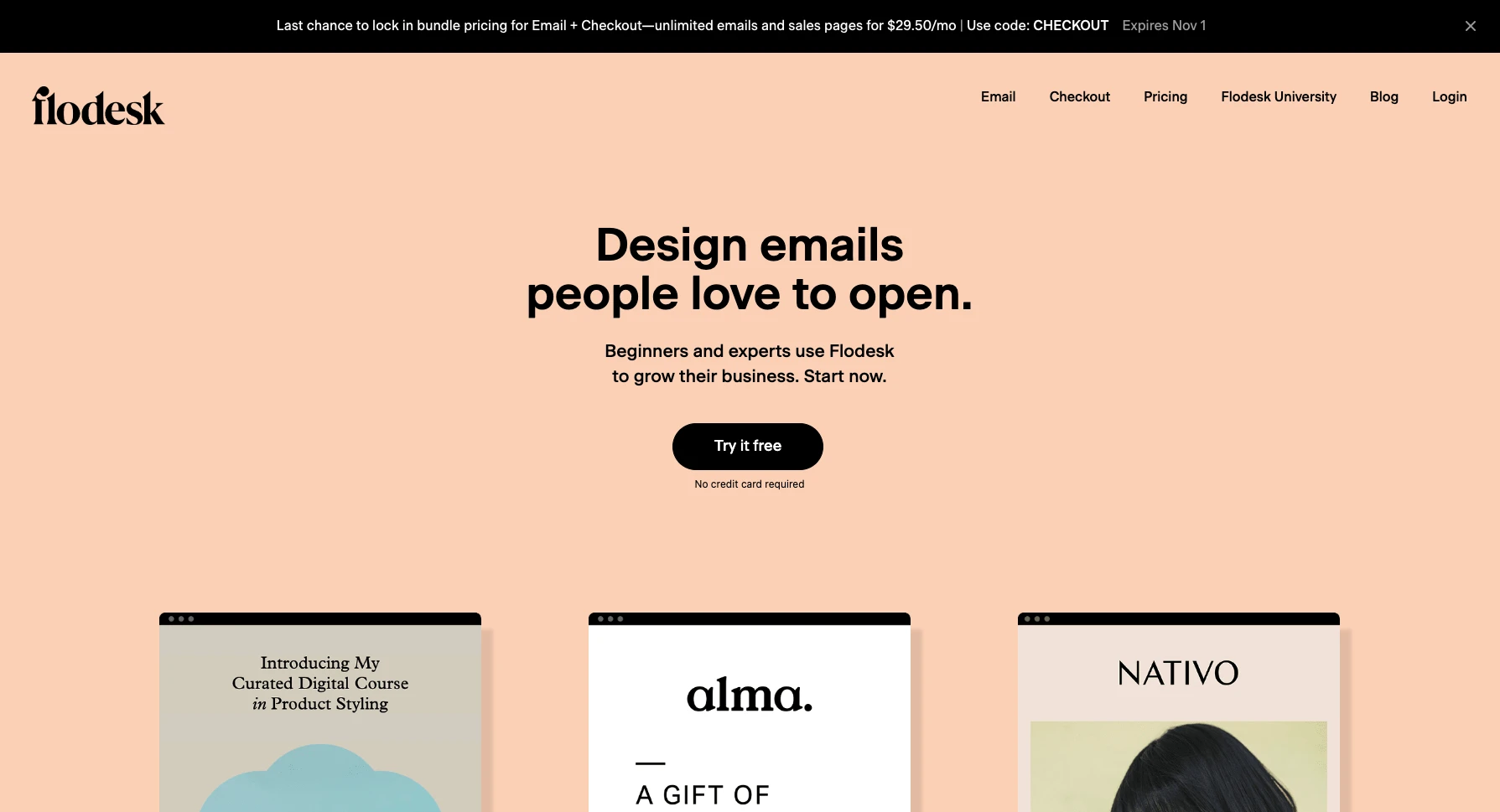
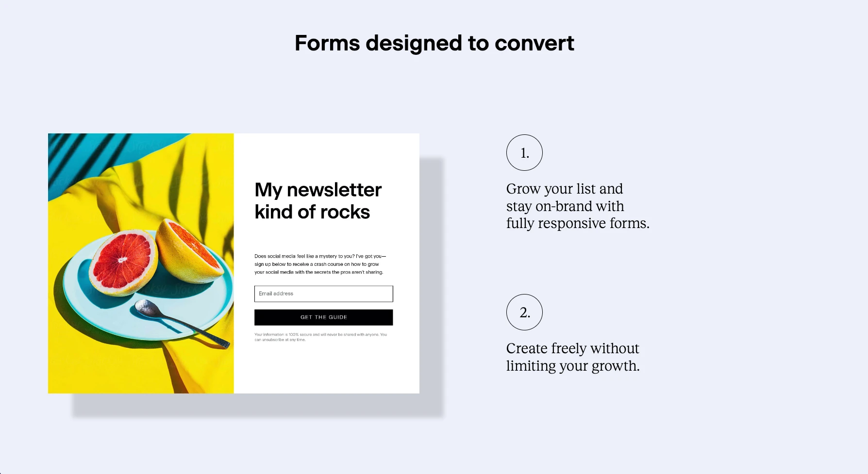
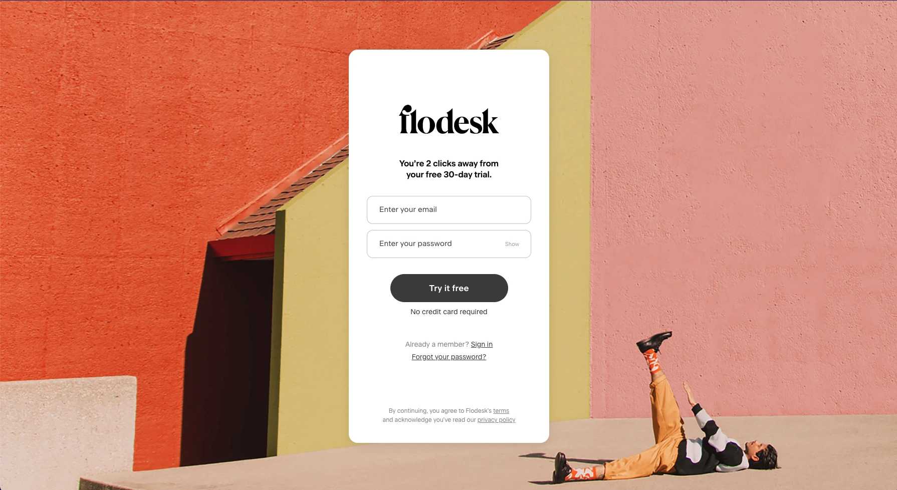
The first thing that caught my eye was the very deliberate and sensible use of open space. The design felt very spacious and although the examples of the app's offerings are "below the fold" there is an inviting feel to it. I was drawn in and immediately scrolled down to see the rest of the content. The heading are large and make the content easy to consume. The copy is easy to read and follow and provides a nice walk-through of what exactly flodesk offers and provides.
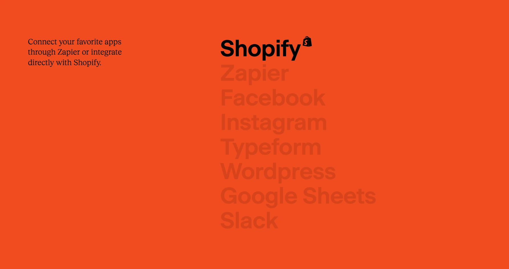
There is also great use of color. While it may seem the color palette is large and all over the place, there is a pleasantness about it. Despite the colors begin rather muted or not very saturated, they present as bold due to their taking over of the backgrounds for every section. They also work really well together, which given the number of colors used, is impressive.
What is the purpose of the design? How has this affected the design?
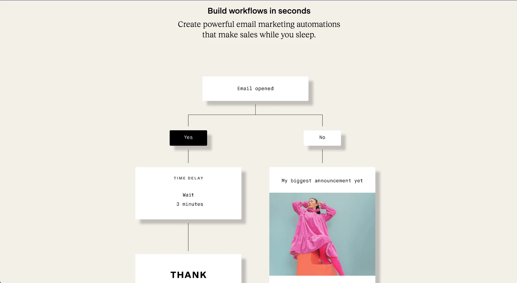
The purpose is to entice the visitor to use their product, an email marketing app, built to be beautiful and enticing. Because the product promises to give the user an edge on getting their users to open, read and possibly buy via their email campaigns, this design needs to do the same.
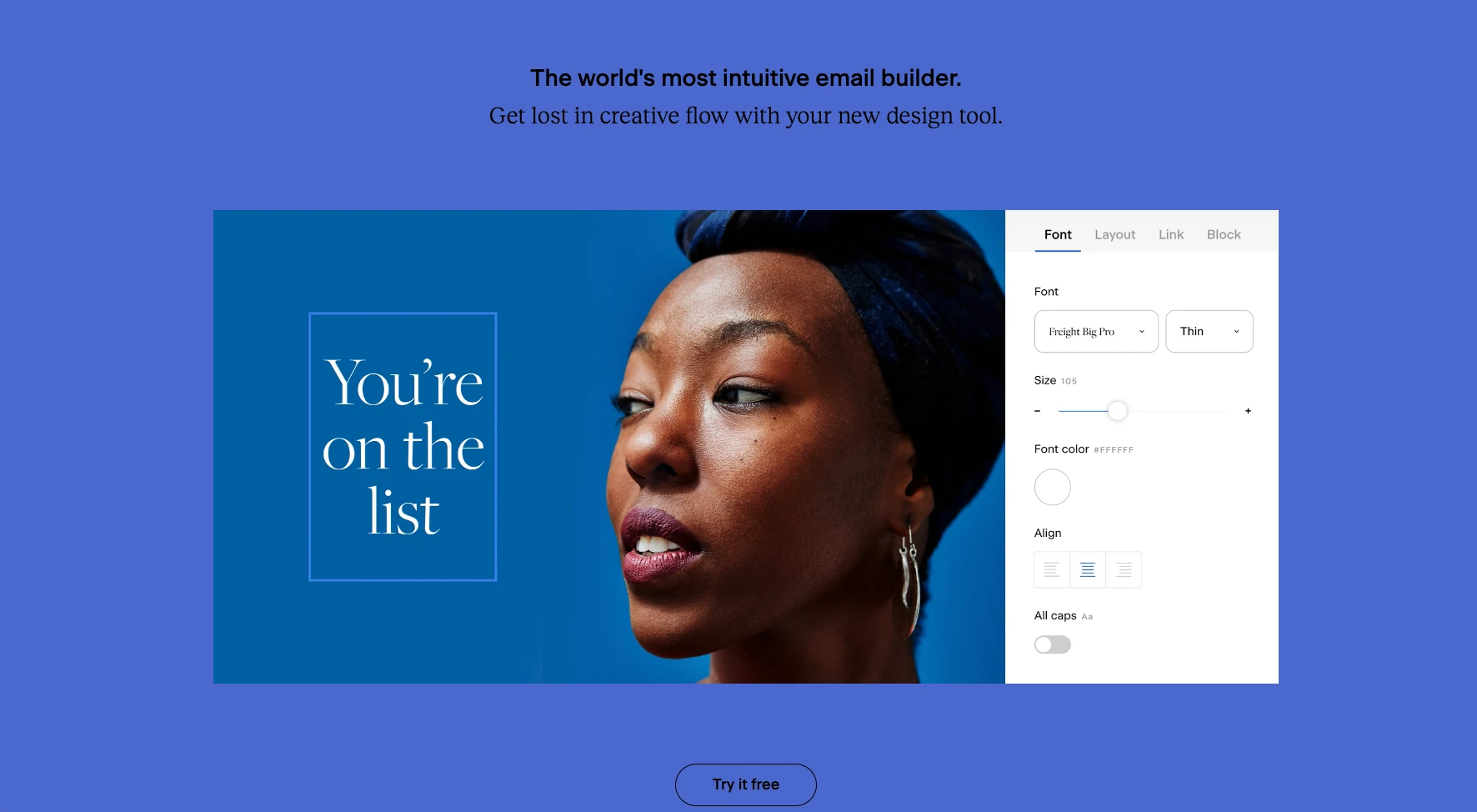
The site needs to entice the visitor to try the product and experience the benefits and advantages it provides. I feel like in an effort to do so, the design was made to flow really well from section to section, page to page. This is thoroughly accomplished with the airiness of the design, the ample use of color and slight animation, both in the landing page content and the product tours provided.
How does this design make you feel?
This design make me feel inadequate as a designer. But more than that, it is very inspring. It has an undeniable pull and makes me want to look at and consume beautiful designs. Not to sound corny, but it almost feels like a digital art gallery, which is probably a goal of the designers and product folks at flodesk. If so, job well done. It does a great job of making me want to emulate, copy, practice, etc. their design aethetic.
How does the type work with the design?
Like colors, there seem to be a varied number of type sizes. However, the sizes seem to get lost in the design. By that, I mean they have a seamless blend with the design to where I really had to inspect the type in the different sections to get a sense of the heirarchy.
So this is a bit weird in that I enjoy the type, I think it works well for the design, but I also find it a bit off. This one is very difficult to explain. It works with the playfulness and design-y aspect of the site. The font pairing is a good combination of sans and serif. I love instances of big type in this site. It produces both a playful and serious design-centric feel.
What could you improve on in this design?
The first thing I think would improve is the use of fonts. While I think the font types and sizes work well, I think I would use the serif font for the headings and the sans-serf for subheadings.
The use of subheadings confuses me a bit so I would make that more consistent throughout the site. Maybe this might interrupt the design or make it less design-y... but I would definintely try it out and suspect that it could improve the design a bit.
Outside of that, I cannot think of anything I could change or improve upon. I will have to think on this quite a bit. To be continued...
@admin | October 20, 2022 | flodesk