What originally intrigued you about this design? Are you still drawn to it the same way as before?
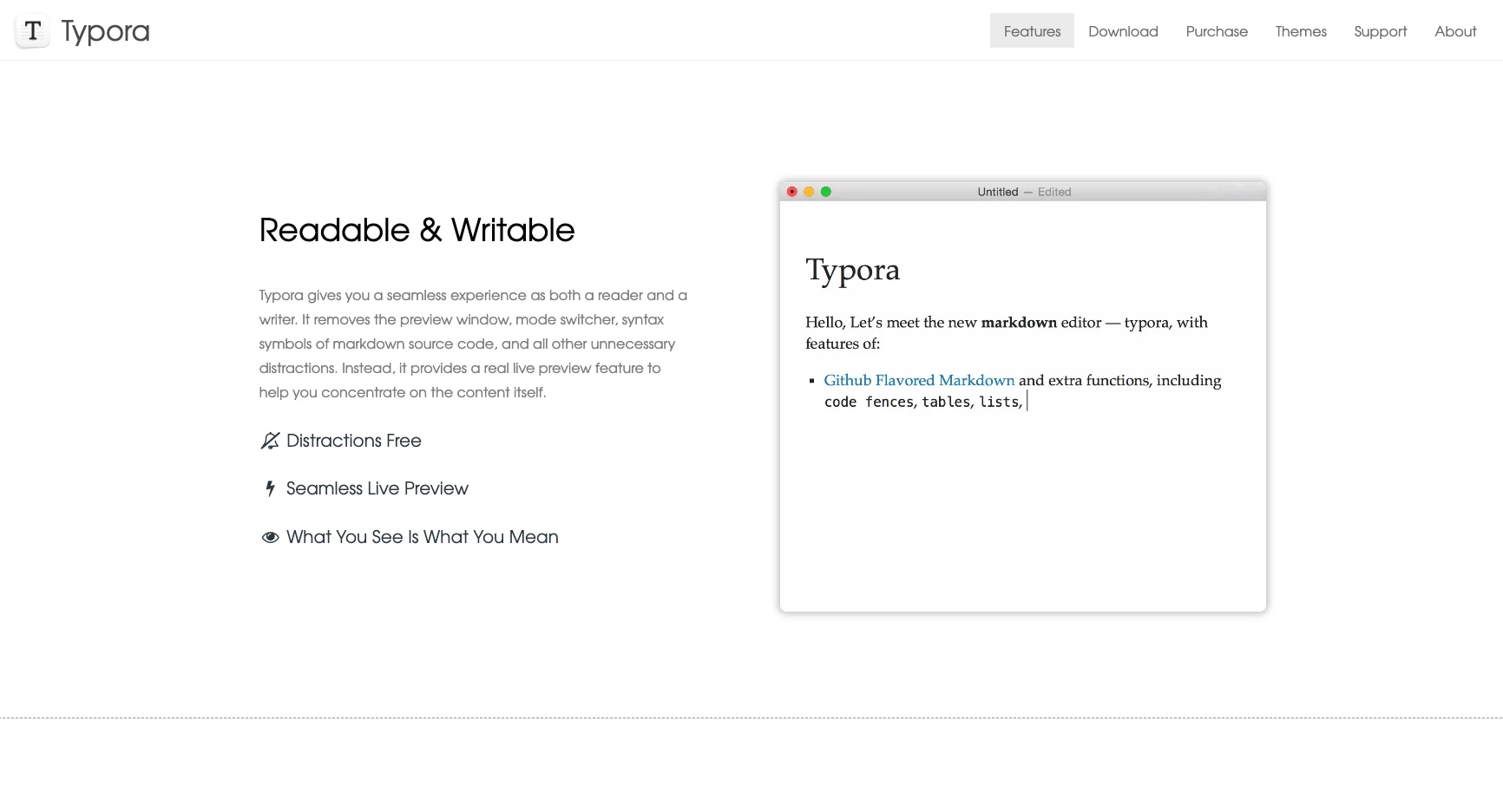
The simplicity and minimalism of Typora's site drew me in immediately. Because of its minimalism, typography has to be front and center. And it is apparent that it was given much consideration. While the screenshots of the app contain a serif font, the site uses a very round sans-serif. It is almost playful in nature but still conveys a serious tone. I am always impressed with the site no matter how many times I look at or come back to it. It is definitely elegant.
What is the purpose of the design? How has this affected the design?
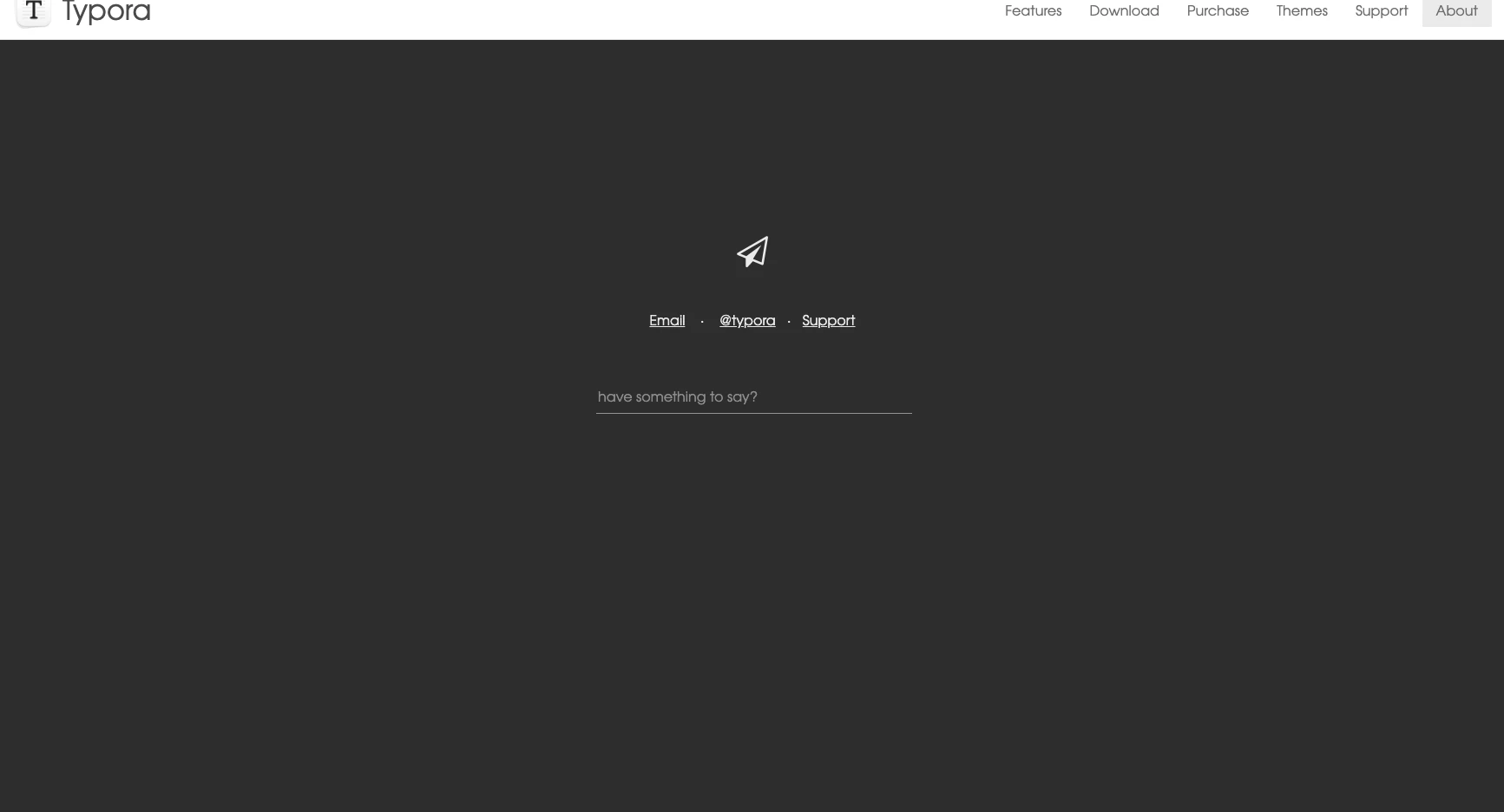
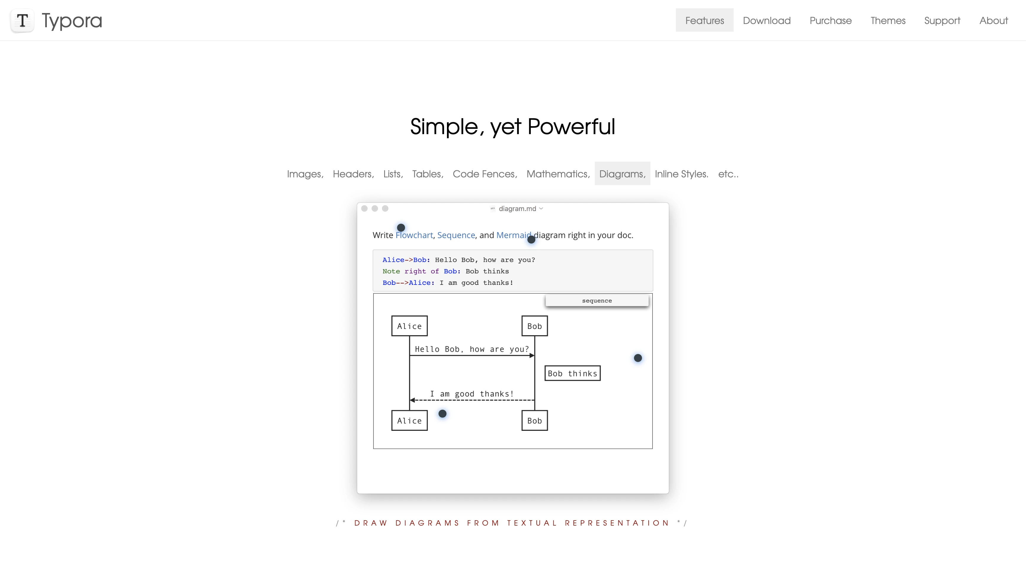
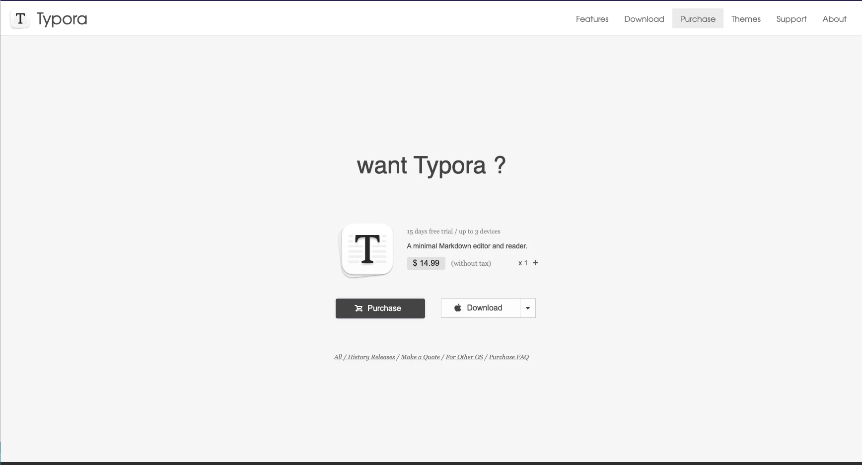
The puropose of the design is to sell the user on the app itself. It is meant to be a showcase of the app's functionality as well as its beauty. It makes the minimalist nature of the app the focal point using that same approach in the site itself. No clutter, no unnecessary design elements or copy. From the app showcase to the sales section to the contact/about section, care is taken to ensure only the necessary information is provided and no more. Moreover, the necessary information looks to be painstakenly laid out and designed to tie the app and the site together as well as preserve the mission and aesthetic of the app.
How does this design make you feel?
It makes me feel as though this is a good tool for distraction-free writing. It also gives me a feeling of trustworthiness, like I can trust the developer and the app. I also feel as though the app and site creators have a solid sense of typography and aesthetic and took this into account when creating the app. It creates a sort of connection with me, a user looking for a writing app, which itself carries some aesthetic requirements. The design connects my requirements with what the app provides quite well. And it feels intentional.
How does the type work with the design?
The type is thin and elegant making the point of minimalist aesthetic. While thin type on the web rarely work, in my opinion, here it accentuates the app's mission and conveys that elegance well. The type stays out of the way simultaneously keeping form with the beautiful minimalism of the entire design, site and app.
What could you improve on in this design?
One thing I think I would change that could improve the site is adding some pops of color. While the site is beautiful as is, I think some brighter color would enhance the pleasantness of the site. There is a red color used for a line of text (YOU FOCUS ON THE CONTENT, TYPORA HELPS WITH THE REST) but I think adding something a little brighter would liven up the site. If I had to pick something without trying it out first, I'd say a bright orange or blue could work.
The only other improvement I can see is working with the tab/link highlights. Currently, they're highlighted with a gray box but I think this could use a bit of work and add some interesting visuals. While they're not bad, I feel they could use a bit of styling to add some visual interest.
@admin | September 27, 2022 | Typora